It should be possible to control any desktop application using just a keyboard. There are certain keys and key combinations that are de facto standard for most applications, and users should be able to expect them to work.

This is a vastly important topic from the accessibility point of view. For a large group of people, a keyboard might be one of the primary ways of interacting with a computer. Pointer devices, while being commonly used by most, just don't work at all for people with visual disabilities, for example.
It's a humane thing to design and put work into implementing an application with these concerns in mind. For example, all interactive elements should be reachable using the keyboard alone, and the navigation should happen in a logical sequence. In addition to that, a visual affordance such as a focus ring should always be available for sighted (or partially sighted) users.
In fact, this is a very important thing, and not only for people with disabilities. It's often crucial when it comes to supporting power users of your application. Using a keyboard can be much more effective than a mouse in some cases. However, it usually requires some manual skills and muscle memory to become really effective at this.
Even if you are not a power user, you probably do some simple tasks using just a keyboard. There are things that we have all internalized and take for granted, but probably we don't appreciate them very much. They already feel natural to us, and it would feel weird if we were to ever find ourselves in a situation where they didn’t work. Can you imagine a chat application which doesn't send a message when hitting the Enter key? Or which wouldn't allow you to change the cursor position using the arrow keys? I can't either. This is just something so simple that we all take for granted. I can't even imagine how it would be to rely on the keyboard heavily, for everything, and having to deal with a plethora of applications with varying support for proper keyboard navigation.
If those things don't work, the application in question doesn't work properly. It's not a matter of choice, priorities, or anything else. Luckily, people are becoming more and more aware of the subject of accessibility, and we can see a great uplift in concern about this.
Focus management
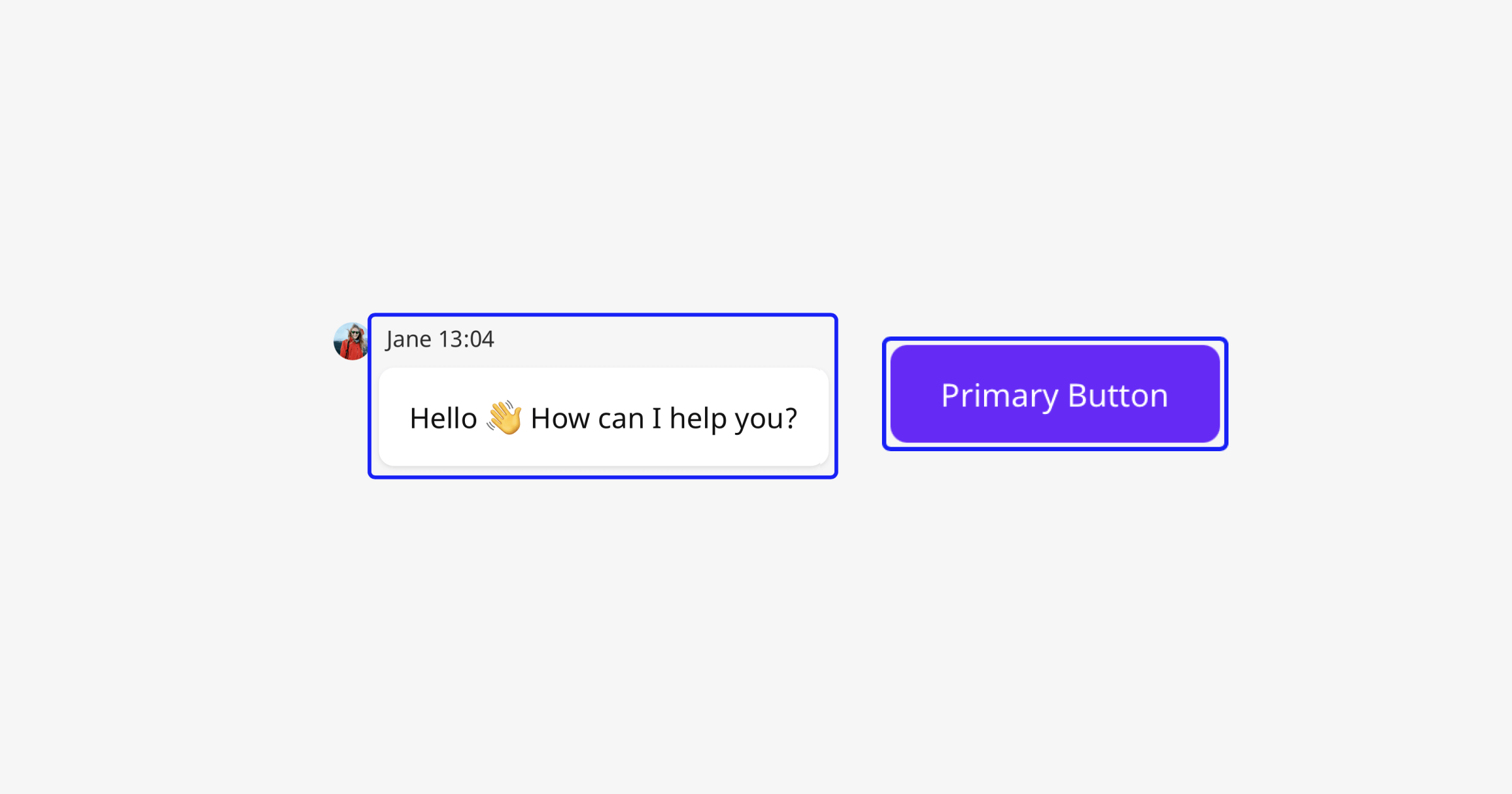
When using the keyboard to navigate an application, it's important to always display a focus indicator, most commonly known as a focus ring, on the currently active element. The browser’s built-in styles, which historically have not been compatible with many website designs, were a reason for developers to disable them altogether. This is a serious accessibility concern; such actions should never be taken unconditionally. To accommodate the design of a site, a custom focus ring can be implemented that will be a better fit for the site.
It's OK to hide these visual cues when the user is using a pointer device to navigate the site, but they should be visible as soon as the user switches to keyboard navigation. Usually, this behavior can be implemented by using :focus-visible selector, but keep in mind that it’s not yet supported by all the browsers.
The topic of focus management is broader than just displaying a focus ring correctly, and for most patterns required for robust and correct keyboard navigation/focus management, a JavaScript-based solution is required.
tabindex
Let’s recap what a tabindex is and what its different values mean for the browser.
A value of 0 means that the element is focusable and participates in the tab sequence, whereas a value of -1 means that the element can be focused programmatically, but it doesn’t participate in the tab sequence.
Other numeric values can, technically, be used as well. Positive ones actually change the order of the tab sequence; so it’s possible to move an element to the front of that sequence by providing a value higher than all others. This is, however, discouraged by all experts, and a consensus has been reached in the community that this should never be used as it creates a mismatch between the tab sequence and the visual order.
Basis patterns
Tabbing
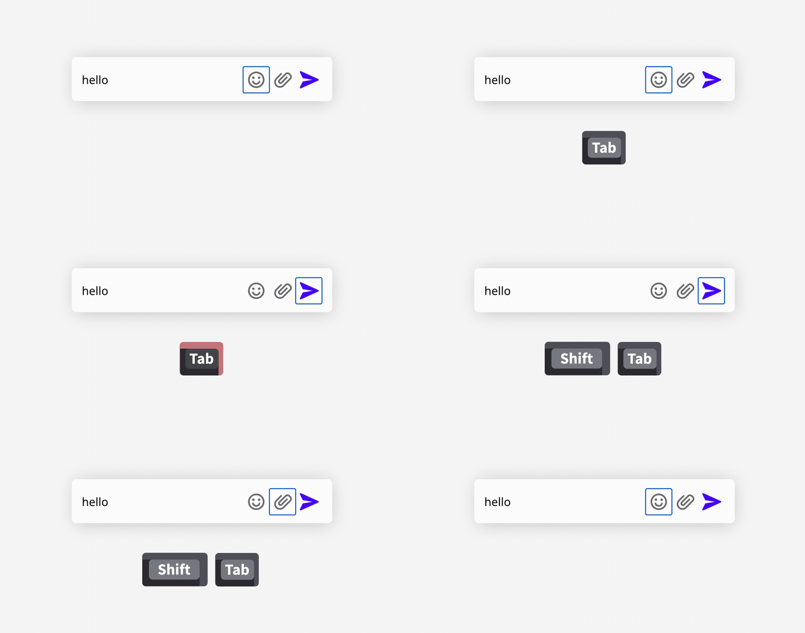
This is something that usually comes for free if we use proper HTML structure. When pressing the Tab key, the focus should be switched to the very next interactive element. When pressing Shift+Tab we should be switched to the previous element. When going forwards and backwards using those key combinations, we should cycle between the same elements. If we leave an element, we should be able to easily get back to it unless there is a strong reason why this shouldn't be possible (for example when the previous element was associated with some expirable content when the expiration would be properly announced to the user).
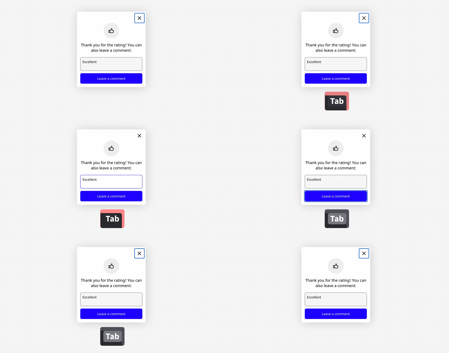
An important thing to remember is that all interactive elements should be reachable using a keyboard. So for example, if we have an element that appears when hovering over another element with a pointer device, then we should also display it when navigating using a keyboard.
Arrow navigation in menus
When it comes to navigation through menus, there are two options — one based on the aria-activedescendant attribute, and the other one based on tabindex manipulations. It's a matter of choice which one gets used. However, from the user experience perspective, both are equivalent — the up and down arrows can be used to go through the menu items, and Enter/Space keys can be used to select the currently active item (and thus also close the menu).
The first option is to leave the focus on the menu button (the element which triggers the menu to be opened) and only highlight visually the "active" list element by juggling the values of the aria-activedescendant attribute in such a way that it points to the highlighted menu item using the global ID value of that active menu item.
The alternative to that is to exclude all menu items (apart from the active one) and the menu button itself from the tab sequence by setting tabindex="-1" on them. The currently active menu item should have its tabindex set to 0. When navigating through menu items using arrows, the previous menu item should be excluded from the tab sequence and the next item should be included in it by properly manipulating the tabindex attribute. To actually move the focus to the next menu item, it is also required that its focus method be called.
Note that, usually, pressing Tab or Shift+Tab while navigating through a menu should bring the user to the next (or previous) element outside of the menu (and its menu button). When using the second way of implementing arrow navigation, it might be required to bring back tabindex="0" on the menu button so it can be navigated back to.
Closing with Escape
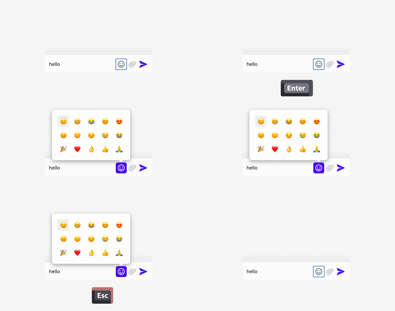
When any element pops out to the user — be it a menu, tooltip, modal, or an emoji picker — then it should be closeable by pressing Escape. There are cases when it is permitted to not implement this pattern — for example, when an opened modal can't be reopened again, but not implementing this interaction should be a conscious design decision.
To implement this it is often required to add a global keydown listener on the document element. The listener should check if the Escape key has been pressed, and if yes, then it should close the open element in response to that.
If you are dealing with nested modals (or a tooltip within a modal, or any other cases that introduce this kind of nesting), then you should ensure that only the element that is open on the very top should be closed with a single Escape key. It would provide a bad user experience if, for example, both modals were to be closed at the same time.
Item activation
This is an easy one — most activatable elements should be activated by pressing Enter or Space. It's easy to forget one or the other when implementing custom buttons (which is sometimes the only way to satisfy the design/layout constraints) or when implementing custom input controls like checkboxes.
Advanced patterns
Focus trapping
In a variety of scenarios, it is desirable to lock user navigation to a certain element. When pressing Tab on the very last interactive element within it, focus should be moved to the very first element in the enclosed group. This most commonly happens when a modal gets displayed to the user. In such a situation the background usually gets dimmed in one way or another; so it doesn't make sense to allow the user to navigate to any element outside the modal. They wouldn't see the active element then, or the modal would have to be closed.
There is no HTML way to achieve this behavior, and a JavaScript-based solution is required to implement it. The idea behind popular solutions is to render additional sentinel elements (for example, empty spans) before and after the locked element. They can either be made focusable so, whenever they receive focus, the focus can be moved programmatically to the appropriate element within the trapped element, or the default action of pressing the Tab can be prevented, and the focus can be moved programmatically to the appropriate element.
Auto focus & focus restoration
This pattern is important for most situations in which a new element that contains navigable elements gets opened in response to the user interaction or when an automatically opened element (like a modal) is meant to interrupt the user.
Whenever we deal with such a situation, we need to move focus to the element that just got opened. Very often, the new element gets actually rendered to the body; so it isn't near the current navigation sequence anyway. If the element got opened in response to a user interaction, then it is a signal from the user that they want to interact with that element; so focus should not stay on the triggering element. By querying the DOM of the opened element, the focus should be placed on the first tabbable element in it, unless there is no such element, then the opened element itself should be focused.
In a similar vein, it's desired that the focus should return to the triggering element when the opened element gets closed. It just makes the most sense as that's the last thing the user remembers. It brings the user to the same context that they previously left.
Grid pattern
While the pattern is very useful for handling tabular content (like spreadsheets), it's not limited to those kinds of use cases. Actually, it can be used purely to create a sort of navigation depth.
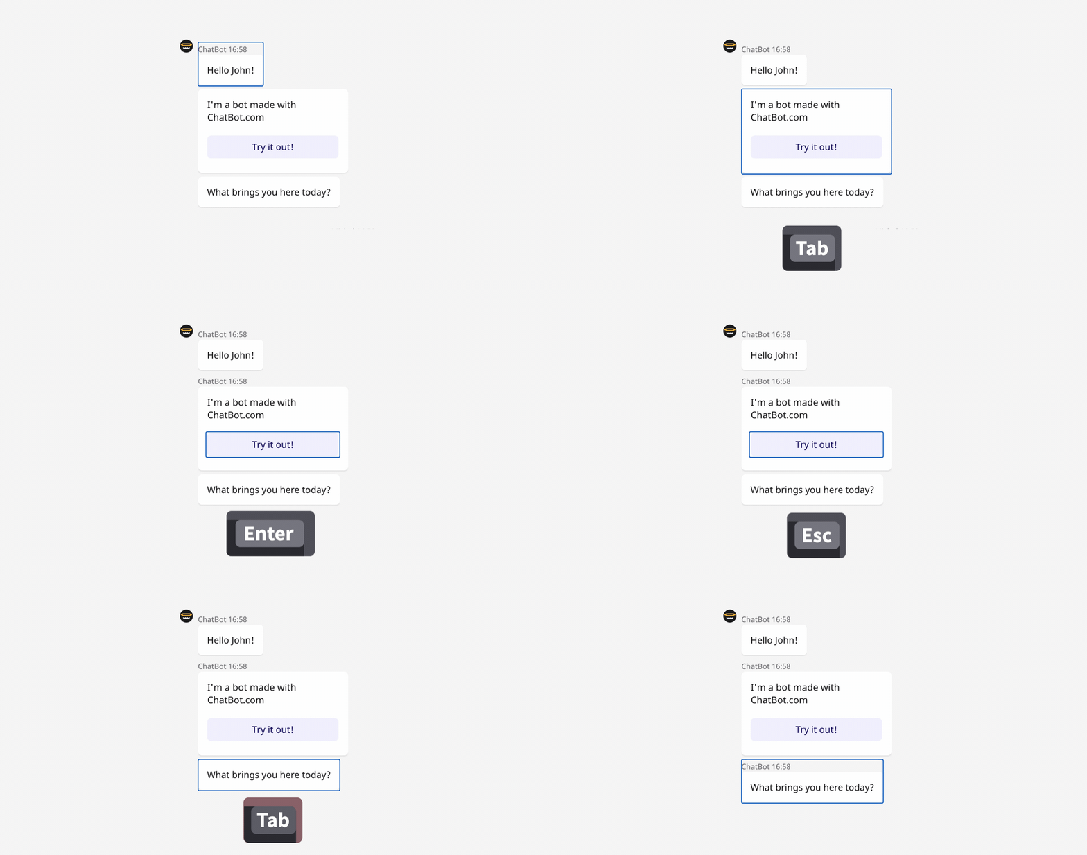
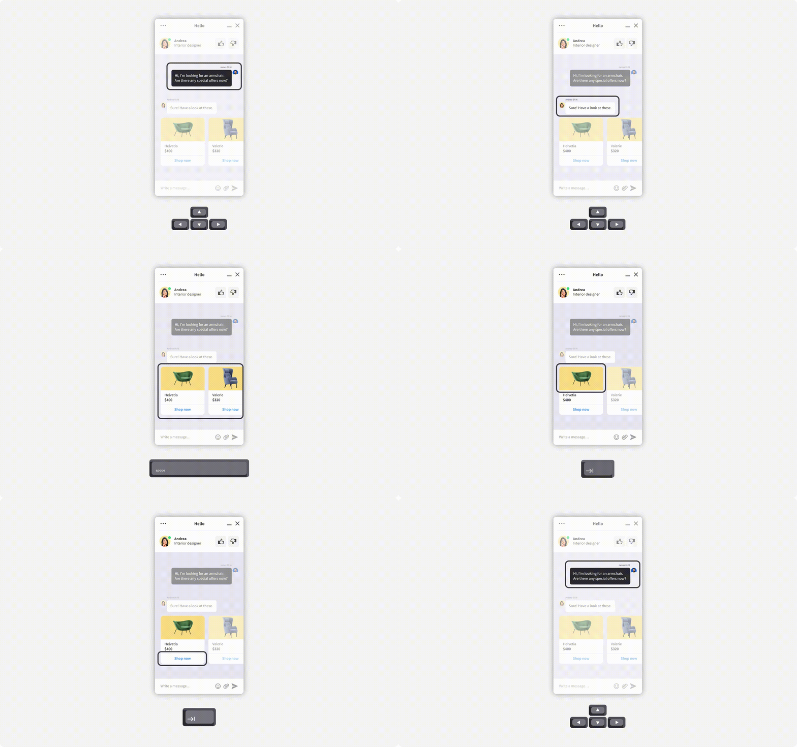
The idea is that the particular container should only make a single element within it focusable, so only that single element acts as a stopgap when tabbing through an application. To navigate to other elements (cells within a grid), arrow keys can be used. This requires the application to have strict layout constraints since the direction of the pressed arrow key should always move focus to the other cell in that direction, and this should always match the visual layout. It would be confusing for the user if pressing a down arrow were to move focus to the element displayed on the right, or things like that.
This pattern is great for very long lists of repetitive elements, like, for example, a list of messages in a chat application. Without using it, the user would have to tab through the whole content of the chat (which grows with time) to get to the elements above or below that chat feed.
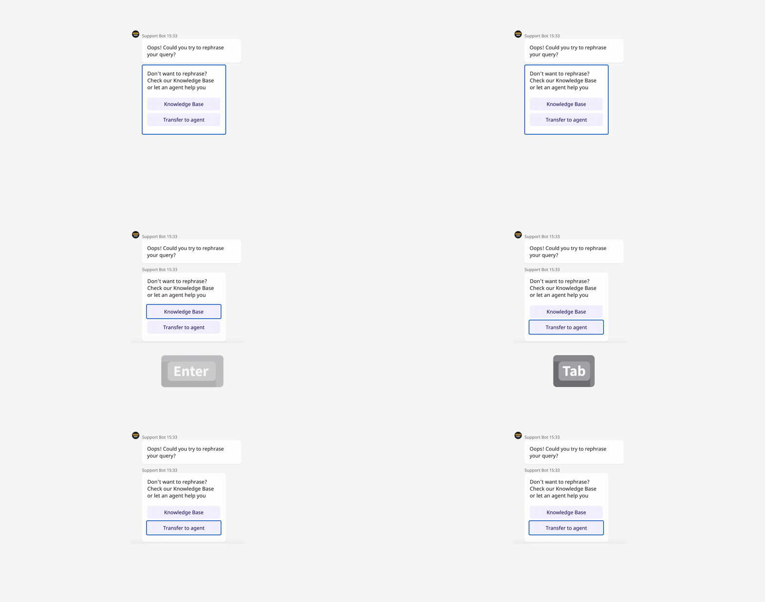
In addition to that, certain cells can have interactive elements within them — a rich message card with interactive buttons can be a grid cell. One can enter such a grid cell by activating it using standard Enter/Space keys. While in the grid cell, the focus should be trapped within it; so pressing Tab repeatedly would not navigate the user to any element outside of this card, and to get back to the main grid navigation, one would press Escape. As you can see in this example, this combines many of the previously mentioned patterns to provide a very rich user experience.
It’s worth noting that the last active element in the grid stays focusable when one tabs away from the grid. This makes coming back to the grid a better experience since the user is brought back to a familiar context.
Summary
As we can see, implementing some of these patterns is quite involved. To do it right, we need to both understand the accessibility requirements and implement several JavaScript-based solutions that often require beyond-novice knowledge of the browser APIs. Doing that in a generic fashion for reusable components that can be rendered in a variety of scenarios is very hard.
Luckily, there are packages that can help you with that, and we highly encourage using them. However, when combining several patterns like this for a single element, you might encounter some interoperability issues between packages. Our widget is implemented using React, and we have discovered that React Aria is a great project, focused on providing developers with a proper base for these and many more accessibility-oriented patterns while allowing developers to provide their own UI and styling solutions.
